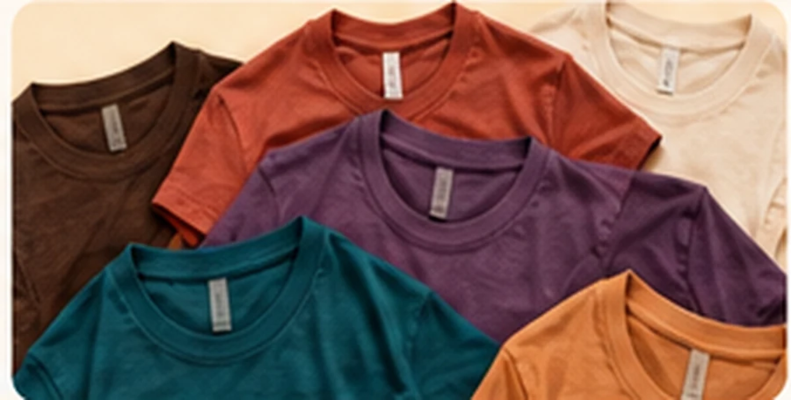
Heather Brown
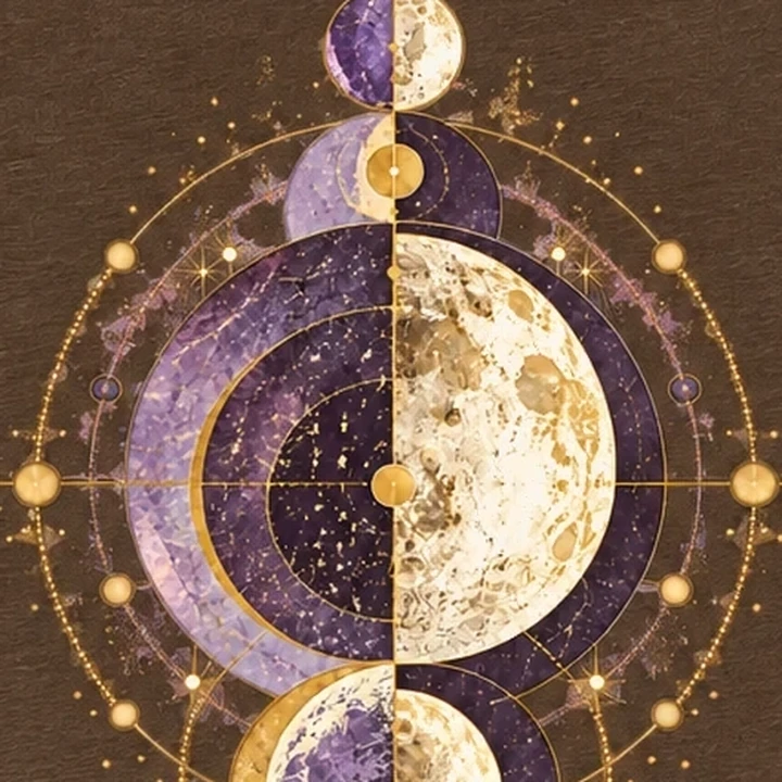
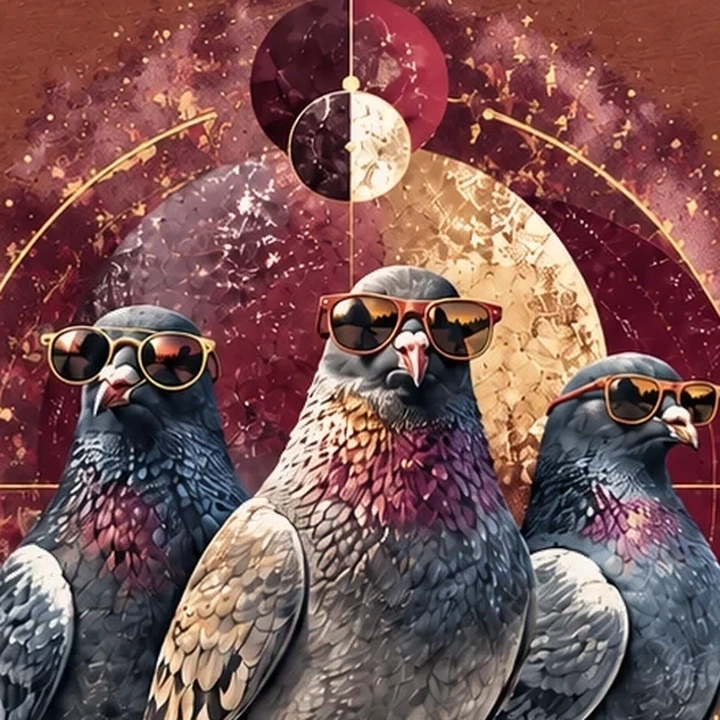
Quietly grounded, infinitely interesting. Try soft ivory type, gold accents, or a surprising touch of lavender.
As seen on Lunar Drift ↗Seasonal colors. Original designs. Endless possibilities.

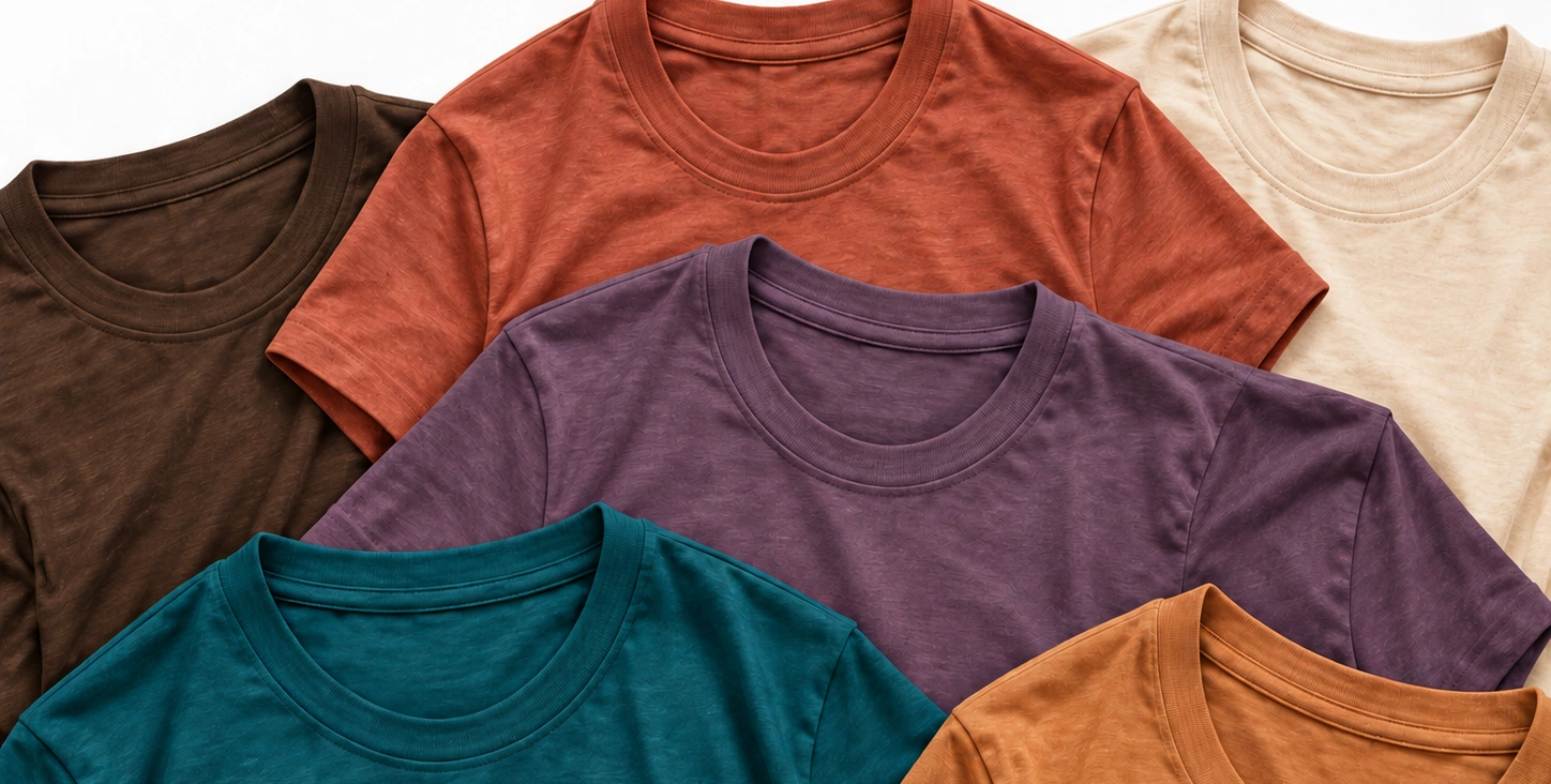
Start with a shirt color that catches your eye. We've paired each shade with three ink colors and a design to show you one possibility.
Borrow the palette. Swap a color. Go somewhere completely different. None of this is a rulebook.
Seven colors we can't stop thinking about. Three coordinating inks apiece. One idea to get things going. Take what you like and leave the rest.
Read the Fall Edit ↗Quietly grounded, infinitely interesting. Try soft ivory type, gold accents, or a surprising touch of lavender.
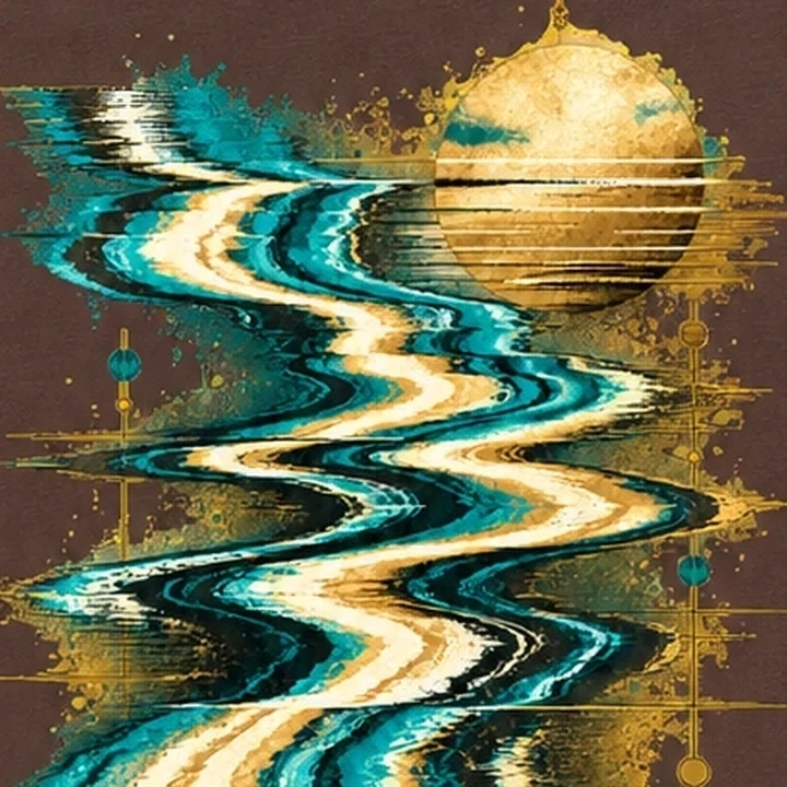
As seen on Lunar Drift ↗Warm, sunny, and already a little nostalgic. Classic cream works beautifully, but navy has something to say.
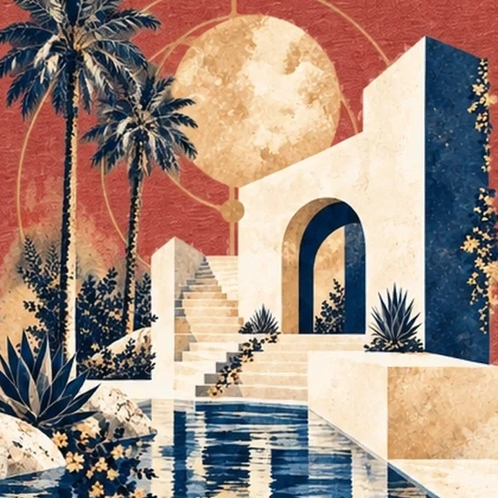
As seen on Pool Hours ↗A little moody, a little playful. Perfect for dreamy details or something wonderfully unexpected.
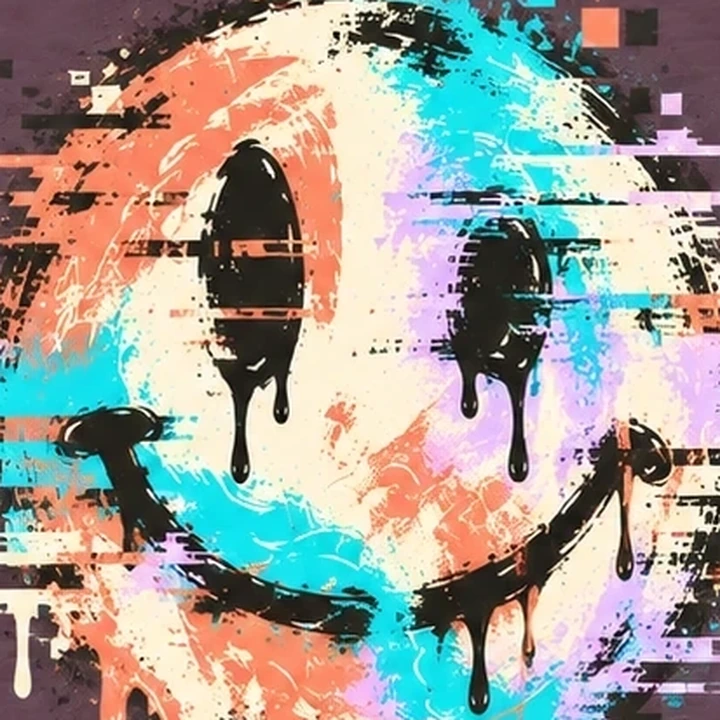
As seen on Good Times ↗Deep and expressive, with room to surprise. Chartreuse makes it electric; ivory keeps things understated.
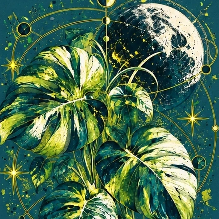
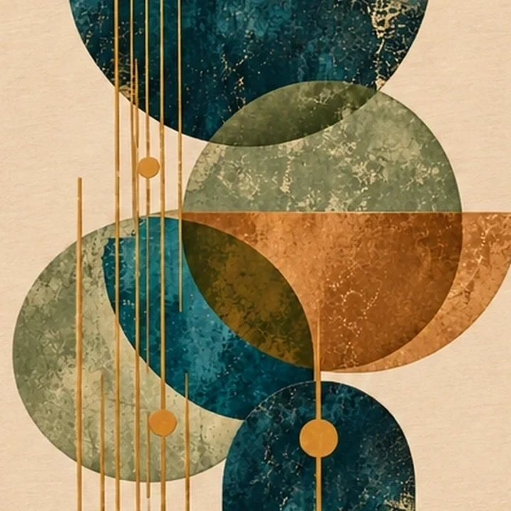
As seen on Plant Frequency ↗Dark, rich, endlessly versatile. Try turquoise for a pop or gold for a little old-school glamour.
As seen on Channel Zero ↗An easygoing neutral with surprising depth. Earthy shades feel natural here, especially with bolder graphic shapes.
As seen on Soft Exit ↗Warm, full of character, and made for a little contrast. Think playful lettering, bold art, and peachy ink.
Perennial Favorites are coming. Think the shades you come back to, the combinations that always work, and the ones you never expected to love.
MORE COLOR STORIES / COMING SOONChoose a canvas. Mix up the colors. Discover a combination that feels like you. No design degree required.
A playful graphic test, not a production mockup. Your saved palette is a starting point for Create Your Own.
01 / Your shirt color
02 / Your three ink colors
Try the suggested trio, or mix in any of the colors from the Fall Edit.
Bring your idea to life ↗Maybe it's an obscure reference. Maybe it's a terrible joke. Maybe you just really like orange on purple. If it feels like you, that's reason enough.